Now for something completely different on the RaceWeek website. Today I am going to be discussing something that is not discussed enough on blogging websites, and that is reviewing the liveries of the 2021 Formula One Season, revealing my opinion on how each of the 10 teams look this year. This article and all following articles about liveries have been inspired by the amazing work of Seb Patrick, author of f1colours.com who tragically passed away last year. RIP Seb Patrick, I’ve missed your opinions on the liveries this year.
Mercedes
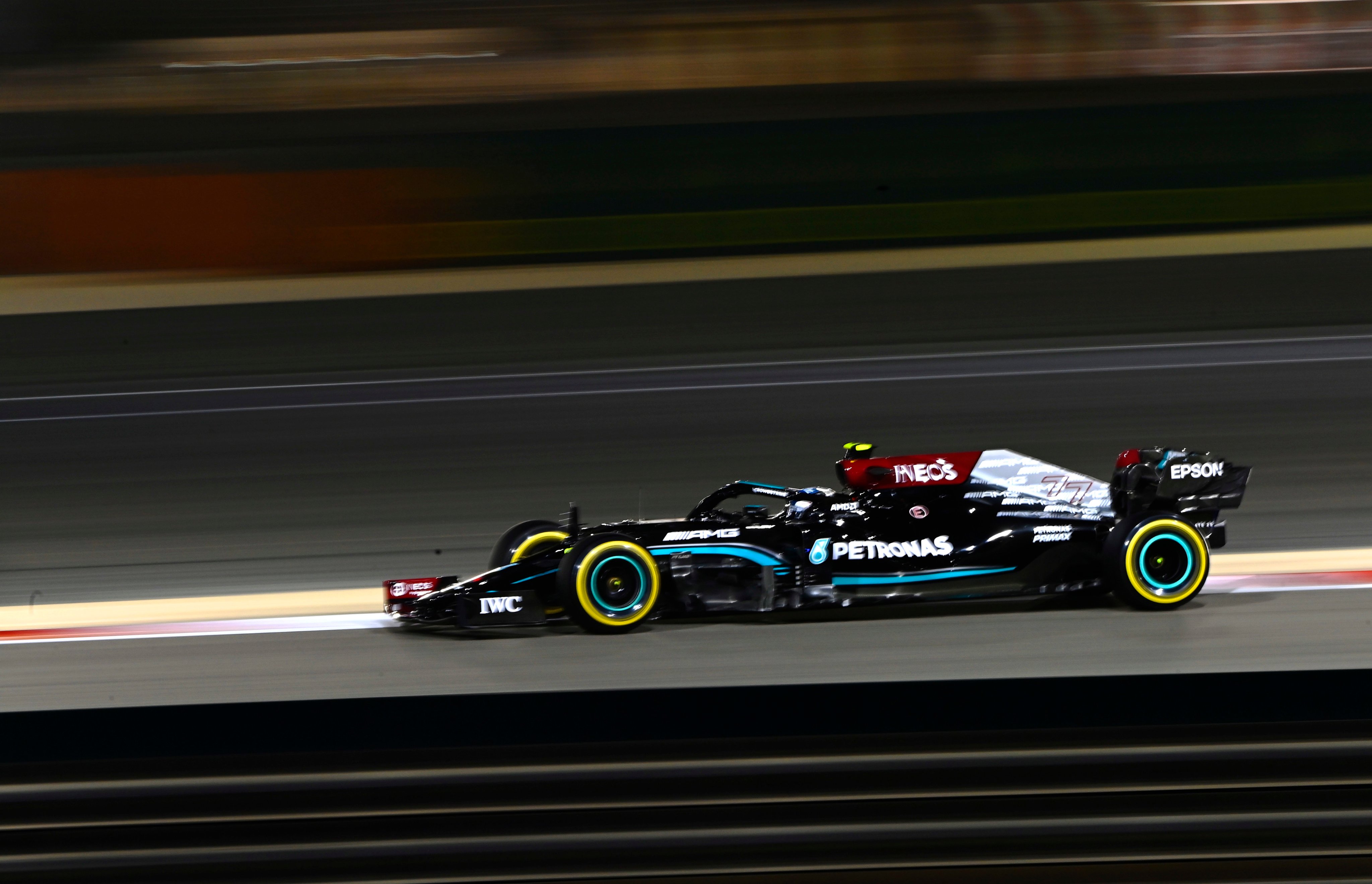
Last year Mercedes had arguably one of the best looking cars on the grid. Breaking a long tradition of racing in silver and switching to a black livery to support the black lives matter movement was such a great statement for them. And the car looked good, the black provided a good canvas for the Petronas stripe, the Ineos red and the three pointed star pattern at the back. It is good that the black livery has been kept for 2021, but I feel like they have made changes that have made the car look a little messy. On the positive side, the Ineos red has been integrated better into the livery. But that’s the only step forward. I don’t like the distribution of the turquoise. Last year the stripe extended onto the front wing, whereas this year the flaps are painted turquoise which I don’t think works as well. The subtle stripes on the halo are gone and replaced with the fairing being painted in turquoise which doesn’t look as good. And adding a silver stripe on top of the turquoise stripe was a mistake as it prevents the latter standing out. But the biggest downgrade is replacing the 3 pointed star pattern that worked so well with AMG logos, which looks extremely cheap and a Mercedes should not look cheap. It also ruins the effect of the black fading to silver which could’ve looked good. And they need to fill in those numbers, they are impossible to make out from far shots.
Red Bull

Aston Martin are gone as they now have their own team, but despite that the livery is basically the same as expected, and is that really a bad thing, as Red Bull have a very distinct identity across all formula that has evolved from their first livery to the matte design we know today. The changes this year surround sponsor logos and filling the voids Aston Martin left off. The change I am a massive fan of is placing the Honda logo on the front of the rear wing. Since Honda returned to F1 I have been waiting for the day Honda would place their logo there on a car as it really looked good on the rear wing of the BAR-Hondas and looks just as good here. Also Oracle have come on board as a major sponsor, filling some of the voids Aston Martin left off. And in the absence of Renault yellow, as the only car with significant amounts of the colour on the grid, the yellow nose and engine cover is quite impactful when viewed alongside the rest of the grid.
McLaren
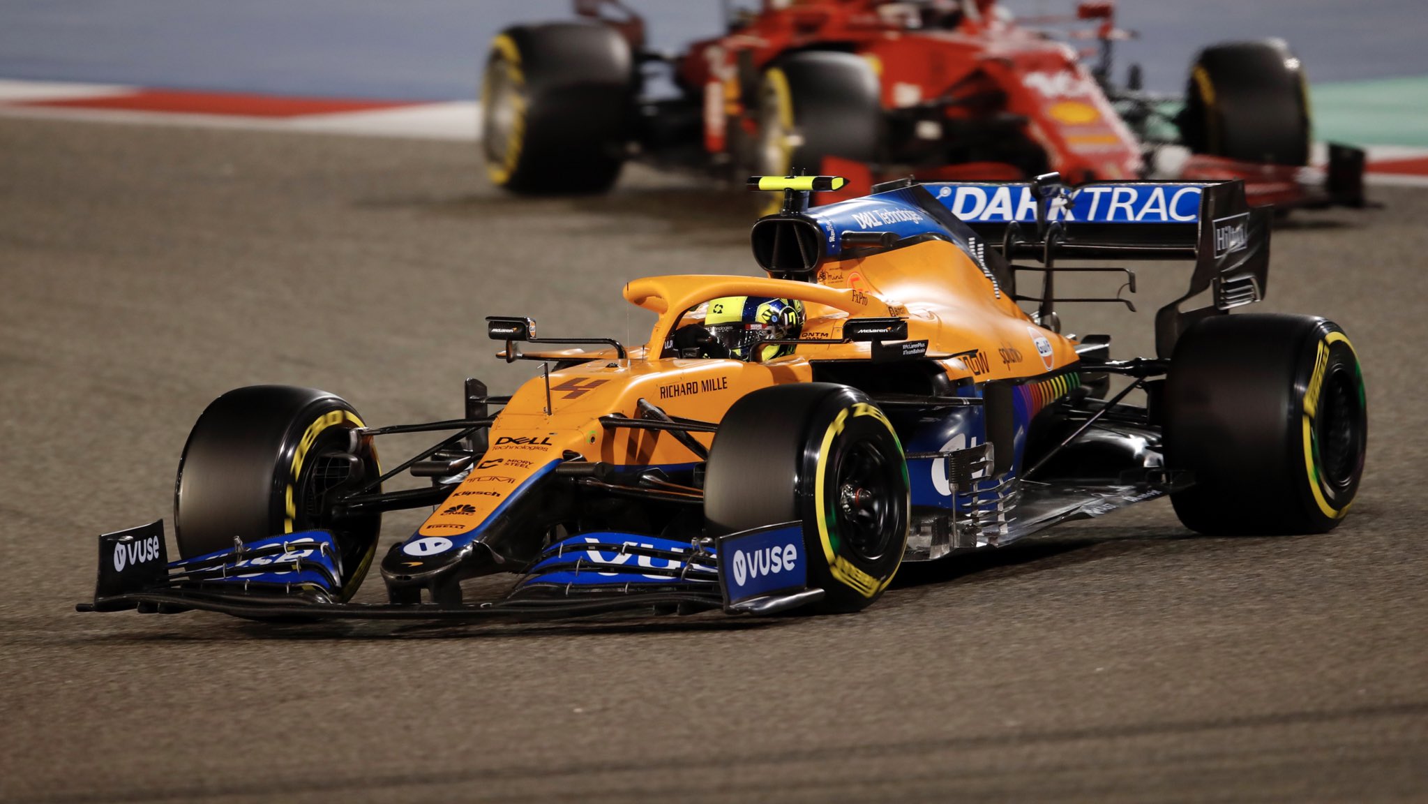
Unexpectedly McLaren launched a livery that was very similar to their 2020 livery. Was disappointing for those who wanted something different, but this is still a nice livery in itself. Keeping the car predominantly papaya orange but having blue seconds on both the front and rear wings, and the sidepod and the engine cover, but perfectly placed so it doesn’t disrupt the effect of the papaya orange. There are changes this year, more blue has been added to the front of the car, and the pattern on the blue areas of the sidepod and engine cover is different. Whilst last year they were straight lines coming out of a black area at the back of the section, this year they are diagonal lines, which looks a lot cleaner and is a better frame for the #WeRaceAsOne rainbow at the back of the sidepod. I do wish they’d stop leaving the sides of the nosecone unpainted though…
Aston Martin

Probably the most anticipated livery of the launch season was Aston Martin’s comeback to F1. And the livery did not disappoint. A predominantly green car with pink accents as a result of BWT’s last minute decision to stay onboard. It looks so undeniably Aston Martin, and one other thing I don’t think many people noticed is the subtly darker swooshes that follow the pink stripe. That was all the complexity that could really be added as any further complexity would’ve ruined the effect of the green. On the negative side, its a bit disappointing the pink stripes aren’t neon yellow like they were originally planned to be before BWT’s last minute deal, and sometimes the turquoisy shade of green can look a bit washed, but those are nitpicks. Aston Martin did not disappoint on their return to the Formula One grid.
Alpine

I for one was disappointed when Renault announced they were rebranding as Alpine. I really liked the black and yellow design, which I think worked really well and stood out on the grid, and was perhaps unrealistically hoping for a combination of the two brands with a blue and yellow livery which would be fitting for Fernando Alonso’s return. But the livery we have is nice, the shade of blue is lovely and looks good in pretty much any lighting, and the red complements it well and is used correctly, again this is a situation where any more complexity would ruin the effect of the blue. The thing I don’t like about the livery is the design on the engine cover which has the feel of having been slapped on top of the livery rather than integrated into the design. The white stripes that go across the diagonal line look a little messy, the extra shade of blue clashes and it should stop where the blue stops, actually I feel like the blue should not stop at all and fill up the entire sidepod, though the black sides look good on the nose. But this is still a nice livery.
Ferrari
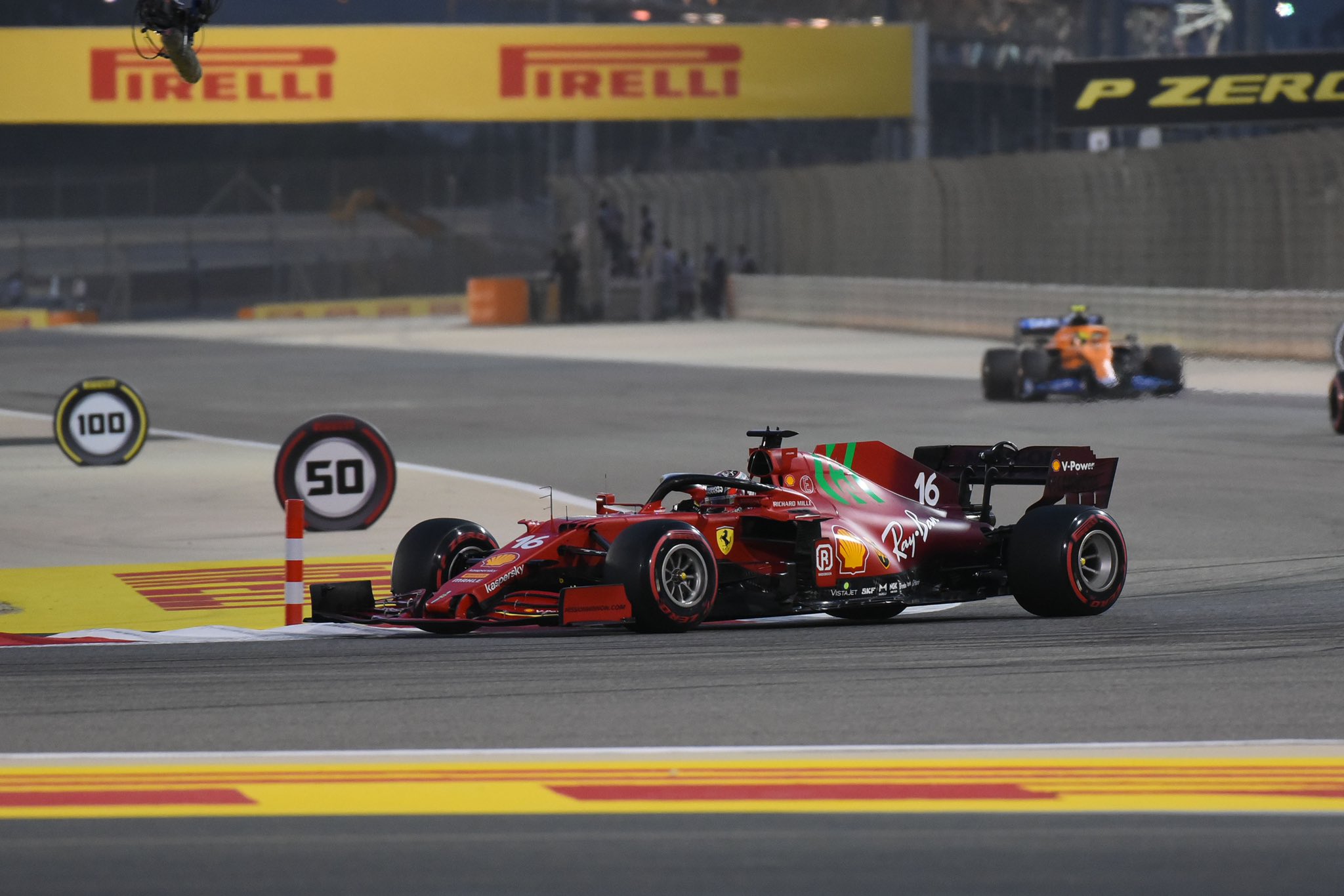
This is a mess. The actual colour scheme, with the transition from the bright red to the burgundy is good and works well, along with the number design. But its issue is the sponsor logos which have been in no way shape or form integrated into the livery and have simply been slapped on in whatever colour they came in. A bit of UPS brown here, Mission Winnow green there, some logos in white, some logos in black. So inconsistent. This has always been an issue with Ferraris but none more so than this year. Of course the biggest issue is the obnoxious green Mission Winnow logo which stands out horribly. But its not the only Mission Winnow logo that doesn’t work. The one on the rear wing, black on a burgundy background, you can barely make it out and it looks sloppy. Of course they are unlikely to be able to run Mission Winnow for most races, but still its a moving billboard with no effort to have any harmony in the livery. I am waiting for the day that Ferrari actually make an effort to integrate their logos and have a coherent livery.
AlphaTauri

I wasn’t expecting much change in AlphaTauri’s second year after a solid first effort. But they have made changes, this time painting the car in mostly navy, with a white section bordered by a pinstripe on the underside. As a completely two tone livery aside from the red Honda logo that contrasts well, it does look smart and unlike their fellow Italian compatriots, the sponsors have been integrated well into the livery, and the way the white section flows to the back of the car is nice. I do feel though that the shade of navy falls a bit flat filling up the whole car, if it was a more vibrant shade of blue it would look great, and if it was black like we originally expected AlphaTauri to be when they were rebranded in 2020, it would probably be the best looking car on the grid. But this shade of navy doesn’t do much for me. Also wish the end of the AlphaTauri badge extended to the airbox inlet so it feels like its part of the livery. Like the white wheels though and the Honda badge looks good.
Alfa Romeo

Wasn’t expecting much change from Alfa Romeo in 2021. But they have made a change by flipping the red and the white at the back of the car and whilst a little messily applied (it could be tidied up a little) it looks good. The newly red sidepod looks good especially with the way the Orlen logo has been integrated into the livery, and I like seeing the Alfa Romeo logo in red on white rather than white on red, as well as the fact some of the sponsors have been put on in the metallic shade of red. Definitely one of Alfa Romeo’s better liveries though I wish they could’ve kept the checkered flag transitioning that featured on its predecessor.
Haas

A slightly controversial livery but I am here to judge how the car looks, and it looks good, they have achieved a good balance on applying a design that features a lot but doesn’t look too busy and cluttered. Signature features of a Haas remain, such as the underlined Haas logo on the sidepod that has been underlined, this time by a red stripe rather than a black stripe. And I like the way the unpainted section at the back of the sidepod/engine cover runs in parallel with the red, blue and white line. A bit of critique I can give the livery is I wish the two red lines could extend from the front of the engine cover to where the red line is on the cockpit, in both instances they stop rather abruptly. But overall a good effort from Haas.
Williams

This has understandably been a bit of a divisive livery, but it has its merits. It is different and it certainly pops on track, especially the striped design at the back of the car. An issue though is the front half of the car and the back half of the car follow a completely different design philosophy. The front half features a large white section that is bordered from the dark blue by a light blue and the yellow. Whereas the back half features the stripes. For me they should stick to one, if one of those philosophies filled up the whole car this would look amazing. Particularly the back half, that dark blue with yellow accents could’ve looked awesome. Also it is good to see yellow back on a Williams for the first time since the 90s but if they are going to reintroduce yellow they should do it properly, it doesn’t really work in the small quantities. But this adds much needed variety to the grid and its refreshing to see.
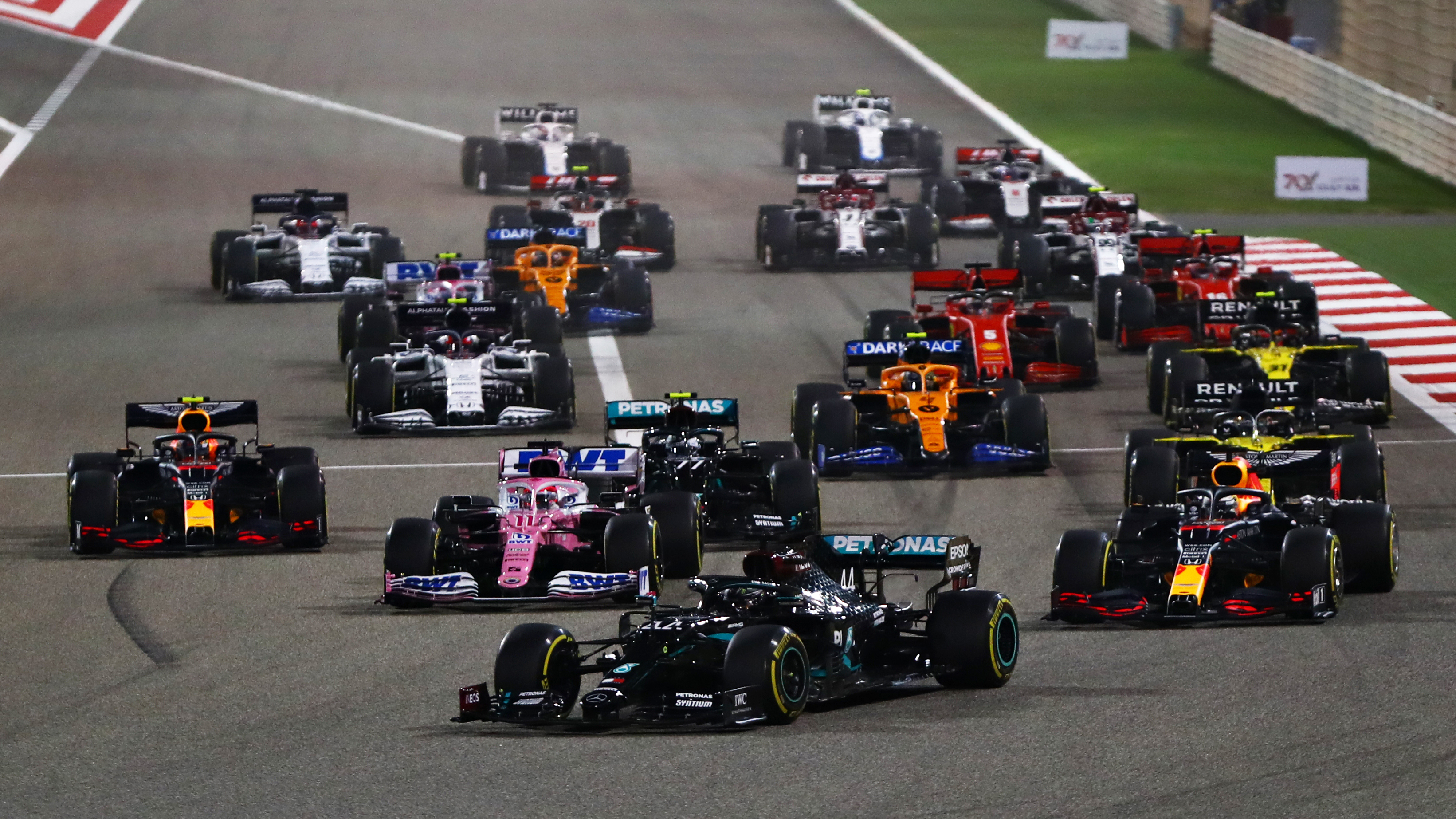

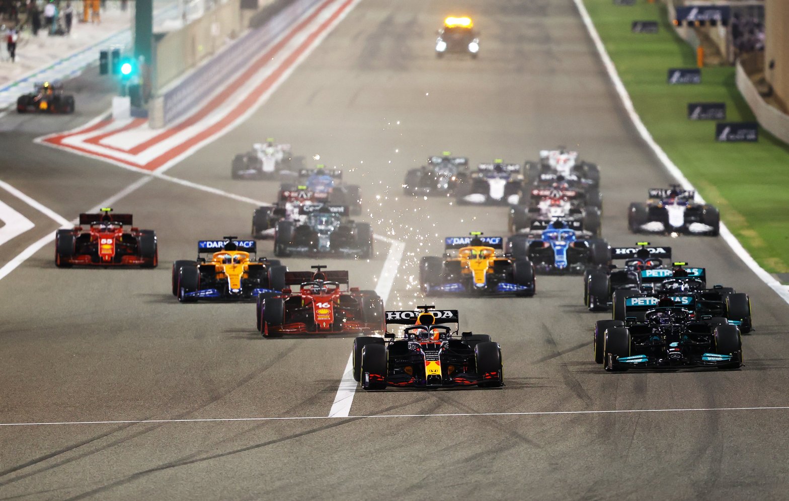
As a whole I think this is a downgrade on 2020. From 2017 to 2020 the grid had a distinct identity, with the usual reds and blues complemented well by the Mercedes turquoise, the McLaren orange, the Force India/Racing Point pink and the Renault yellow. Now we have lost the pink and the yellow. In the place of the Racing Point pink we do get a colour that hasn’t really been seen on the grid since Caterham left in the form of green, but when looking at the starting shots, the grid lacks life and looks a bit incomplete compared to last year, I always believe when you have red, blue and green together, especially with orange in the equation as well, there needs to be yellow as the grid then ends up looking a bit diluted. But its still a world away from the mid-2010s where the majority of grid was monochrome.
Here is my rankings of the liveries of 2021.
- Aston Martin
- Alpine
- Red Bull
- McLaren
- Alfa Romeo
- Williams
- Haas
- Mercedes
- AlphaTauri
- Ferrari
